CSS水平垂直剧中
绝对定位 + margin:auto
html
<style>
.wrp {
background-color: #b9b9b9;
width: 240px;
height: 160px;
}
.box {
color: white;
background-color: #3e8e41;
width: 200px;
height: 120px;
overflow: auto;
}
.wrp1 {
position: relative;
}
.box1 {
margin: auto;
position:absolute;
left: 0; right: 0; bottom: 0; top: 0;
}
</style>
<div class="wrp wrp1">
<div class="box box1">
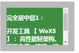
<h3>完全居中层1:</h3>
<h3>开发工具 【 WeX5 】: 高性能轻架构、开源免费、跨端、可视化</h3>
</div>
</div>剧中元素box1不需要计算大小。
效果图
绝对定位+margin反向偏移
html
<style>
.wrp2 {
    position: relative;
  }
  .box2 {
    position:absolute;
    left: 50%;
    top: 50%;
    margin-left: -100px;
    margin-top: -60px;
  }
</style>
<div class="wrp wrp2">
    <div class="box box2">
        <h3>完全居中层2:</h3>
        <h3>开发工具 【 WeX5 】: 高性能轻架构、开源免费、跨端、可视化</h3>
    </div>
  </div>
剧中元素需要确认大小,margin 上 、左是元素对应高、宽一半,反向。
绝对定位+transform反向偏移
html
<style>
.wrp3 {
    position: relative;
  }
  .box3 {
    position:absolute;
    left: 50%;
    top: 50%;
    transform: translate(-50%, -50%) // 和方案2一样
  }
</style>
<div class="wrp wrp3">
    <div class="box box3">
        <h3>完全居中层3:</h3>
        <h3>开发工具 【 WeX5 】: 高性能轻架构、开源免费、跨端、可视化</h3>
    </div>
  </div>
display: table
html
<style>
  .wrp4 {
    display: table;
  }
  .sub4 {
    display: table-cell;
    vertical-align: middle
  }
  .box4 {
    margin: auto;
  }
</style>
 <div class="wrp wrp4">
    <div class="sub4">
        <div class="box box4">
            <h3>完全居中层4:</h3>
        </div>
    </div>
  </div>
display: inline-block
html
<style>
.box5 {
    display: inline-block;
    vertical-align: middle;
    width: auto;
    height: auto;
  }
  .wrp5::after {
    content: '';
    display: inline-block;
    vertical-align: middle;
    height: 100%;
  }
</style>
  <div class="wrp wrp5">
      <div class="box box5">
          <h3>完全居中层5:</h3>
      </div>
  </div>
display: flex-box
html
<style>
  .wrp6 {
    display: flex;
    justify-content: center;
    align-items: center;
  }
  .box6 {
    width: auto;
    height: auto;
  }
</style>
<div class="wrp wrp6">
      <div class="box box6">
          <h3>完全居中层6:</h3>
      </div>
  </div>